Choose Peace
Introducing new cover art by Astra Papachristodoulou
Patrick Romero McCafferty: To misquote James Schuyler, a word’s weight counts aside from what it means. Which is to say that language has a measurable physical presence, whether spoken or printed. We live in a time of throw-away discourse, of discardable text and a mounting digital papertrail to account for our friendships and our labour. As with the best visual poetry, I find a counterflow, an eddy in that verbal white water in the way Astra Papachristodoulou works. Her poems are the result of processes with many physical steps. There’s fine art in this dedication, a curation of the bold voice they contain, but there’s an ornamental gardener’s sensibility there too: tending to the delicate, living line, helping it grow and bloom. Literally organic in many cases, they speak to their surroundings in their finessed, carefully-crafted way (a gallery, a library, a book) asking what the lyrics’ material presence implies for our ethics and politics.
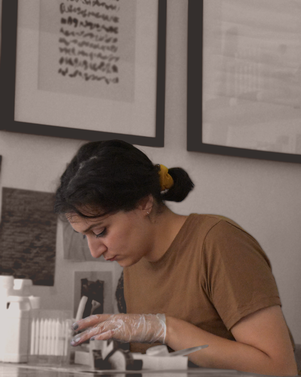
Astra Papachristodoulou: I used a pine canvas for the base, and purified (white) and unfiltered (golden) beeswax for the mixture - the variation in the beeswax adds translucency and different hues to the top layer. I mixed a small amount of damar resin in the beeswax mixture to stretch the longevity of the artwork - I have found that the damar resin acts as a hardener, but also makes the aroma of the finished product more rich, as it blends in with the sweet scent of beeswax. In terms of the letter transferring process, I used a heat gun to warm up the surface of the waxed canvas, and then proceeded to transfer the main text onto the board. The beeswax soaks in the tissue paper with the text on it while the letters stay visible at the surface of the artwork.
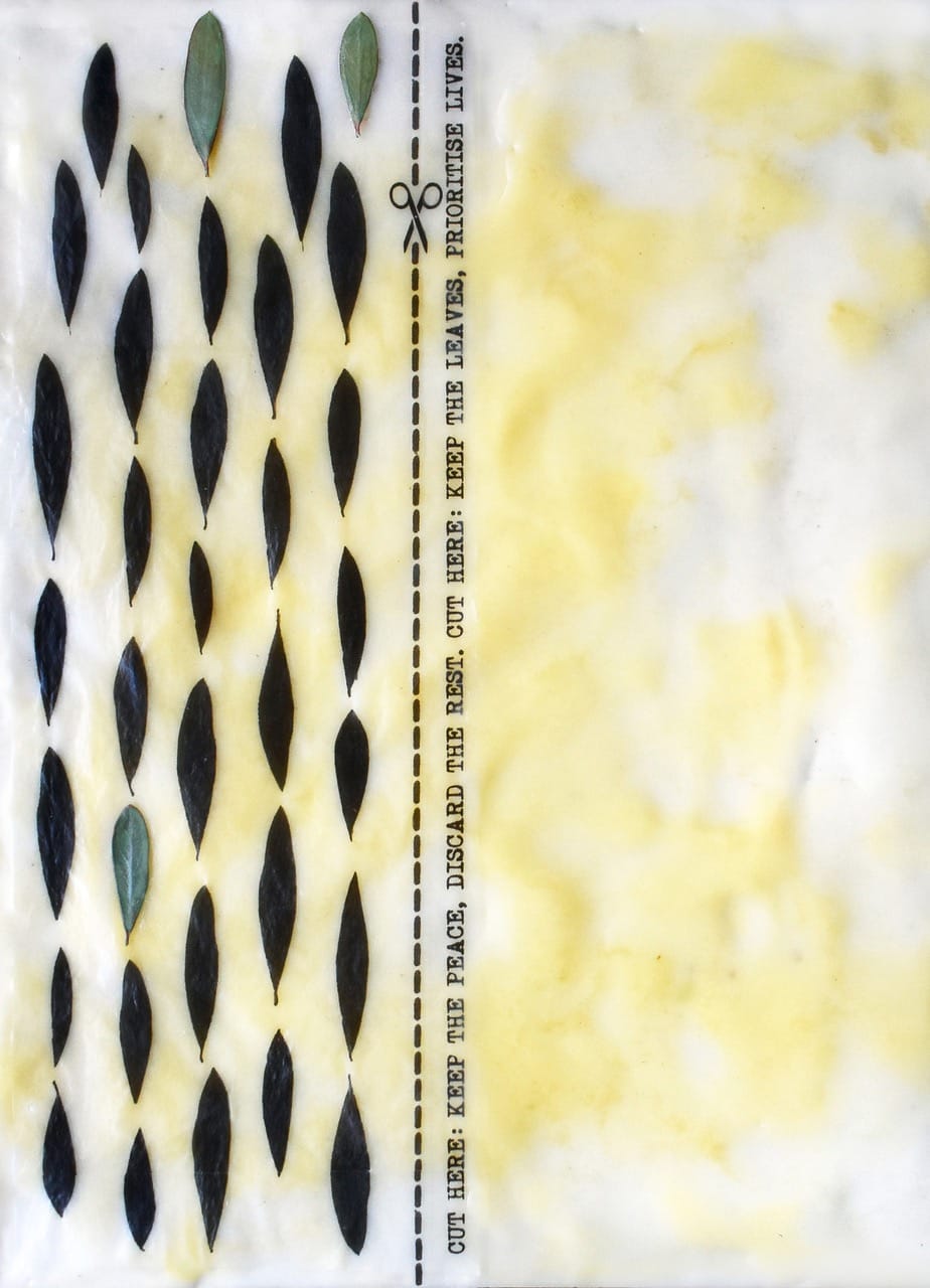
In terms of the concept, I thought that an instruction-based visual poem with simple, directional language (“cut here”) would point to the power of humans to ultimately cease suffering for others by making better choices. The majority of the olive leaves are printed in black to suggest the lives lost in wars - I was aiming for the black leaves to appear like shadows of the real leaves against the canvas. I used a few real olive leaves from my garden to add vitality to the work - these green leaves are symbols of hope and resilience. Finally, the purified beeswax in the mixture refers to human fat aesthetically and metaphorically. This abject material, although it is traditionally associated with excess and waste, is simultaneously vital for human life as bodies live by metabolising fat to create the energy necessary for bodily functions.
Having always enjoyed hand-printing covers for past issues, it's such a pleasure to give Issue Seven a form that opens up new possibilities in print and physical poetry. Astra will be designing the covers of our summer and winter issues too.
Patrick Romero McCafferty
Interested in becoming a paying subscriber? Find out more about our pricing plans here: